10 Web Design Trends 2022
This last year 2022 has brought interesting phenomena in web design. Some of them had appeared before, but they have gained more attention this year, others have appeared quite recently. We have selected the 10 most interesting trends.
1. Retro

View full page - www.magnetimarelli100.com
In design, you can more frequently feel a hint of longing for the past years. Designers go back to the 1980s and to the 1950s, perceived in the USA as idyllic, or are inspired by the design of the beginning of the Internet era.
Retro style can often be seen in the type of fonts used. Typically, such fonts (e.g. Art Nouveau or vintage style) are the focal point of the home page, while the rest of it remains minimalist. This creates an atmosphere of nostalgia, and at the same time the website is not overloaded with unusual, more difficult to read fonts.
Retro fits perfectly, for example, with a brand that sells products based on traditional recipes or want to refer to tradition in a different way. The style of the '80s or '90s with excessively pixelated icons and expressive colors is a slightly ironic "wink" to the client.
2. Glassmorphism
View full page - www.dribble.com
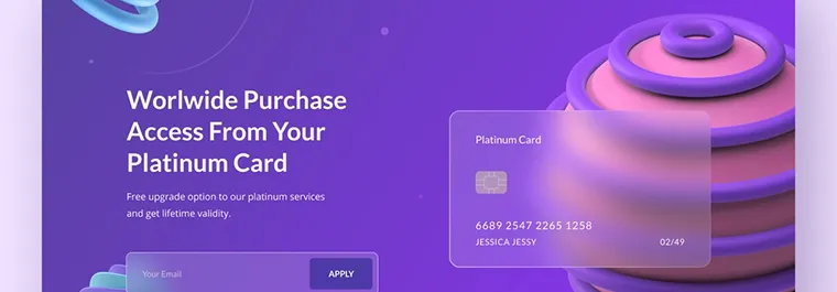
Many designers try to create three-dimensional pages. One of the ways to achieve this goal is glassmorphism. To simplify it, the elements on the page, such as windows or buttons, give the impression that they are made of glass.
This effect is achieved thanks to the use of delicate frames and shadows, as well as blurring the background that is under the elements (often gradient). Thanks to this, the website can look futuristic and encourages interaction (for example, if the button is "closer", the user is more likely to click it). At the same time, the design is clean and clear.
3. Large, bold fonts
View full page - www.florentbiffi.com
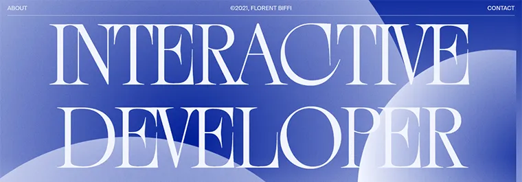
As can be seen on many retro websites, font can become the most important graphic element of the website. Bold fonts often occupy most of the homepage space, which is minimalist. It is the fonts that give character to the website.
Bold, large fonts scream from the screen and can be used to express a strong message. In this way, the basic advantage or element of the brand's offer is emphasized. This is a good way to, for example, ‘sell’ a catchy slogan to your users.
4. Neo brutalism

View full page - www.juiceboxnewhaven.com
Brutalism is a trend of architecture from the 1940s, which was characterized by minimalism and austerity. And these are the designs that follow this trend. They are characterized by the use of simple shapes and sharp contrasts. This minimalism can favor UX.
These types of pages are very expressive, almost aggressive in nature. They are able to present the brand as modern and self-confident. Neo brutalism will be perfect for websites related to art, design or, in our example, even gastronomy.
5. Engaging interactions
A user (accustomed to using smartphone applications) browsing static pages may start to feel bored. Interactions activate him/her because there is a chance to make direct contact with the website. For example, when mouse movements make fonts or icons move, it feels as if the website is communicating with them.
The fact that the interactions arouse the user's interest may reduce the bounce rate. There is also an increased chance that a visitor will click a moving button or scroll a page when scrolling causes movement on the screen. The interactive elements may also include films or 3D graphics that react to the user's actions.
6. 3D elements
View full page - www.chirpley.ai
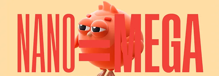
3D graphics give the impression of depth and look realistic. We can thus keep the attention of the visitor who remains on the site while being impressed with the design. There is an even greater chance if the graphics move, which will make the site dynamic.
3D is a great way to showcase your product. Thanks to its three-dimensionality, it will be almost tangible, which will increase its attractiveness. It can rotate in animations, so it will be shown even better. When movement of the object is triggered by the user, engagement is achieved resulting from the possibility of interaction.
7. Original illustrations

View full page - www.roomrs.co
This trend has been popular for a long time, but its popularity is not weakening. By enriching the website with original illustrations, it can take on an individual character. It is also a great way to introduce a brand hero that will accompany the brand during communication in various channels.
Very often, 3D or abstract illustrations are used. The latter are characterized by simplicity and clarity and often strong, contrasting colors. Designers also use handwritten illustrations (which look so at least). They allow you to refer to, for example, retro style, giving the brand a nostalgic character.
8. Large website footers
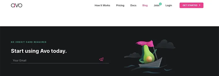
The trend of enlarging the footers of websites has been visible for a long time. The large footers not only make the design interesting, but also have practical functions. This is a good place for additional information, a search engine or a contact form.
If a clear and extensive menu appears in the footer, it will systematize the page, introducing order and encouraging further exploration of the site. Placing a Call to Action there, like subscribing to a newsletter, will make the website similar to a landing page. After reading the content, the user will know what action we expect them to take.
9. Clear section framesi

View full page - www.bloomberg.com
Designers are increasingly using strong and visible frames that divide the page into sections. This demonstrates the structure of the website and gives the impression of it being organized. At the same time, it gives it a more austere look, evoking associations of the 90s.
However, caution must be exercised when delineating the sections clearly. A website with an excessive number of frames may appear cluttered. Its severity can become a disadvantage, because users, who are used to smoothly switching sections , may find the page unfinished and unattractive.
10. One-page
The year 2022 brings with it an increase in the popularity of one-page websites. Designers appreciate their undoubted advantages. One-page browsing is smooth as they only contain the most important content. In addition, they are linearly ranked and can end with a clear call to action.
What is especially important, one-page websites are mobile-friendly as they do not force the user to use navigation. Of course, such sites will not work for companies that have a more extensive offer. However, they will be perfect as a portfolio or in the case of less complicated services.
Trends. Yes, but...
Following new emerging trends is undoubtedly an inspiring activity and is worth doing. It allows you to apply new elements or ideas to your websites to give them a look that will attract the user's attention. Many of them also introduce clear value that can improve the user experience.
On the other hand, one has to remember that the website design must first and foremost express the character of the brand. The most important thing is UX. The design must be subordinate to the goal we set for the user. Therefore, blindly following trends can be fatal for a designer. Nevertheless, it is important to keep your finger on the pulse and get the best out of the latest trends.


