A 404 page appears to a website visitor when the link they clicked leads to a non-existent subpage. It is good to avoid such situations by monitoring errors and fixing incorrect links, but this is not always possible (e.g. when the users make a mistake in the address themselves). So, since users cannot avoid seeing the 404 page from time to time, let's make sure that it is a positive experience for them.
Why is a 404 page important?
Seemingly, the 404 page does not mean much to users - they only find out that the subpage they were looking for does not exist. In its simplest version, it does not contain any valuable content, only a link to the home page. It can also happen that websites direct the user to the home page automatically using a 301 redirect, but this is not a good idea. Let me tell you why:
If users see the home page instead of the desired page, they will be confused. They won't understand why they're there and may want to look up the link they're interested in again to try and link to the right page. When the situation repeats, they will be frustrated and may feel that it is an error in our linking, which is more annoying than a non-existent page.
If we detect incorrect links on our website (e.g. using the Broken Link Checker plugin for WordPress), we can redirect the user to the correct page, also using a 301 redirect. This way we will maintain the SEO power of website addresses. If the user makes a mistake when entering the address or we no longer have the content on the website, we can only display the 404 page, minimizing the negative effects.
How can this be done?
1. Include a search engine
Search engines are often used by users, especially if the site has a lot of content or pages or subpages. Thanks to this, the visitor may end up on a page similar to the one he/she was looking for or be interested in a completely new topic. Either way, he/she stays on the site and continues to explore it.
The example from OptinMonster also shows the use of a link to the home page and contact, which shows the user ‘where to go’:

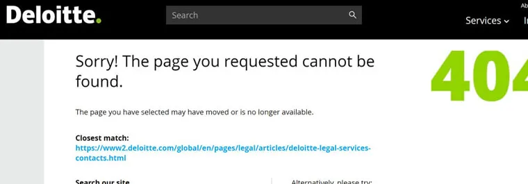
The Deloitte website also encourages you to contact the company if the link provided on the website is incorrect. In this way, it collects information to fix broken links. There is also the address of the page closest to the one that the user is looking for and other links to which he can go. Thanks to this, the 404 has a chance to keep the visitor on the site.
Otter on the other hand, placed a purchase option on its 404 page. They enriched the whole thing with funny text and graphics:

2. Show popular products or content
In the case of e-commerce websites, linking on the 404 page to products that may be of interest to the user will work. In this way, we have a chance to turn the display of this subpage into an opportunity for additional sales. This can be seen on the example of e-Bay, which also added a friendly text. The products are shown here with prices and attractive discount information, which increases the chances of purchase:

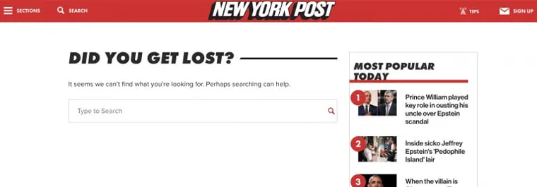
News content pages might be linked to those that are currently the most popular or recent. The user will gladly go to such content. New York Post is an example here. In addition, there is a search engine here:
3. Offer a discount coupon
Hitting the 404 page does not have to mean a waste of time for the client, but could even be a measurable benefit. For this to happen, it is worth offering them a special offer. This will give the impression that it is offered to the client as an apology’ for not being able to find the right page. This can be seen in the example of Land's End:

4. Impress with creative graphics
The frustration of the clients related to the missing page they are looking for can be significantly weakened if we amuse or delight them with great quality graphics. In this way, we will show a sense of humor and, above all, that we attach great value to design. An example of this would be 404 of Lego:

Comedy Central also bet on the entertainment of visitors. Their graphics are additionally consistent with the nature of the website:

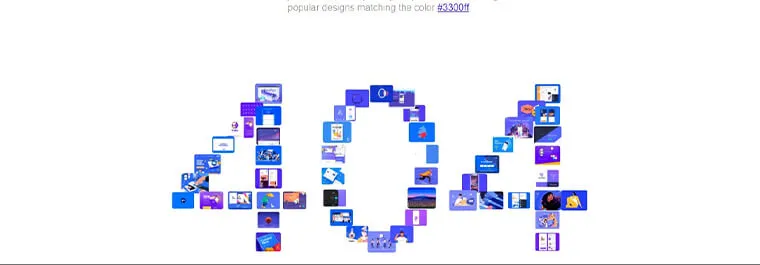
Dribbble also uses graphics creatively. The collage forming the inscription "404" consists of elements that link to popular projects published on the site. When hovered over, the rectangles enlarge, thanks to which an additional effective and engaging interaction is introduced:
Disney in turn, posted a good-looking animation referring to one of their films. It keeps the users in the universe of the brand and entertains them.

5. Get new customers
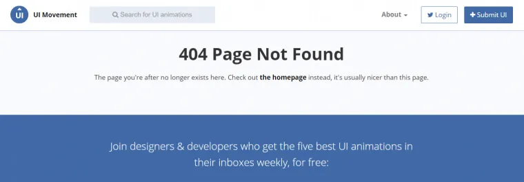
A 404 page is also a great way to generate leads. We can, for example, encourage users to subscribe to the newsletter, as UI Movement does:
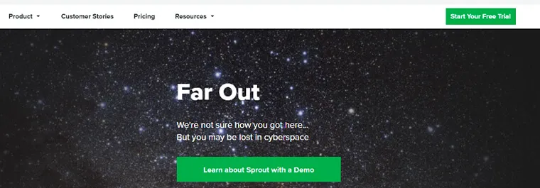
Sprout Social in turn, places an incentive to use the demo version of the product in addition to the subscription option. This is a great way to increase sales.
404 page - don't waste the opportunity!!!
Unfortunately, we are unable to avoid displaying the 404 page to the user in certain situations. However, the above examples show that this necessity can be turned into success. We will successfully use it to encourage the user to make a purchase on the website or explore it further.
If we take a UX-centric approach to creating a 404 page, hitting it will prove valuable to the visitor. For example, graphic creativity in design and a sense of humor should be used to show the character of the brand or increase user involvement. It is therefore worth using the decks of ingenuity and not treating the 404 as only a necessary evil.